Paris Spring Break 1984
Class: Fall Graphic Design
Year: 2017
Materials: Adobe Illustrator
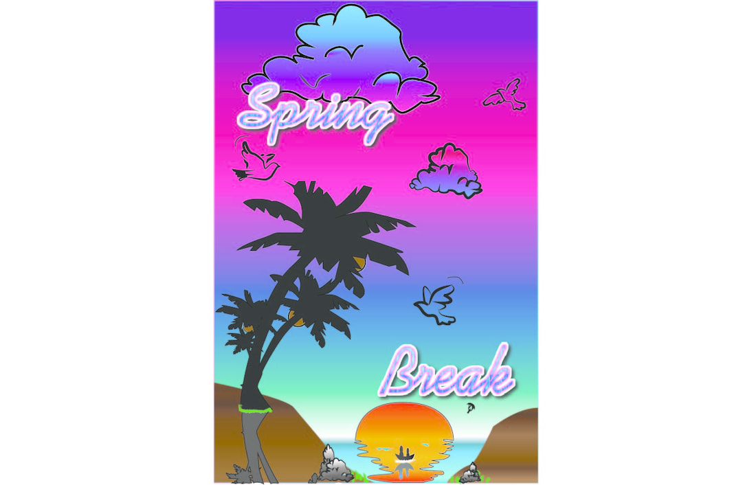
I was inspired by a recent date and the event that happened and it was Friday the 13th after new downloadable content was released. I was inspired from the spring break downloadable content and I wanted to be able to have a fun sense of what to do as it was extraordinary. I love the beach and long for a place called Paris, a sentimental yearning for a reality that doesn't exist which is a happy place for me according to the Chainsmokers. I was motivated by my passion for a landscape and a place that calms me down or soothes my soul and emotions. This project's meaning was that fun in the sun can happen in an imaginary paradise or you can actually live it as the best time of your life. Either way you can escape you problems and just forget about everything and let loose. I wanted this imaginary paradise to be realistic because I want to go to a beach or somewhere tropical to escape. It is my Paris and I can live it all to myself or talk to others depending on how much I want to escape to this place when I am having a bad day. This is something partially out of my imagination and dreams when I escape life. I have a pure conscience to control everything there in that reality like the sun for lighting the way, the waves for the serenity of my thoughts, the refection for seeing the truth, the tree for resting of course, and the doves for peace in my state of mind.
Year: 2017
Materials: Adobe Illustrator
I was inspired by a recent date and the event that happened and it was Friday the 13th after new downloadable content was released. I was inspired from the spring break downloadable content and I wanted to be able to have a fun sense of what to do as it was extraordinary. I love the beach and long for a place called Paris, a sentimental yearning for a reality that doesn't exist which is a happy place for me according to the Chainsmokers. I was motivated by my passion for a landscape and a place that calms me down or soothes my soul and emotions. This project's meaning was that fun in the sun can happen in an imaginary paradise or you can actually live it as the best time of your life. Either way you can escape you problems and just forget about everything and let loose. I wanted this imaginary paradise to be realistic because I want to go to a beach or somewhere tropical to escape. It is my Paris and I can live it all to myself or talk to others depending on how much I want to escape to this place when I am having a bad day. This is something partially out of my imagination and dreams when I escape life. I have a pure conscience to control everything there in that reality like the sun for lighting the way, the waves for the serenity of my thoughts, the refection for seeing the truth, the tree for resting of course, and the doves for peace in my state of mind.
https://docs.google.com/document/d/1OdvNNjIuPZ73FvvzFeHY6_35NJeV1RrihK32LBY64as/edit
Friday the 13th: Jarvis Residence
. Class: Fall Graphic Design
Year: 2017
Materials: Adobe Illustrator
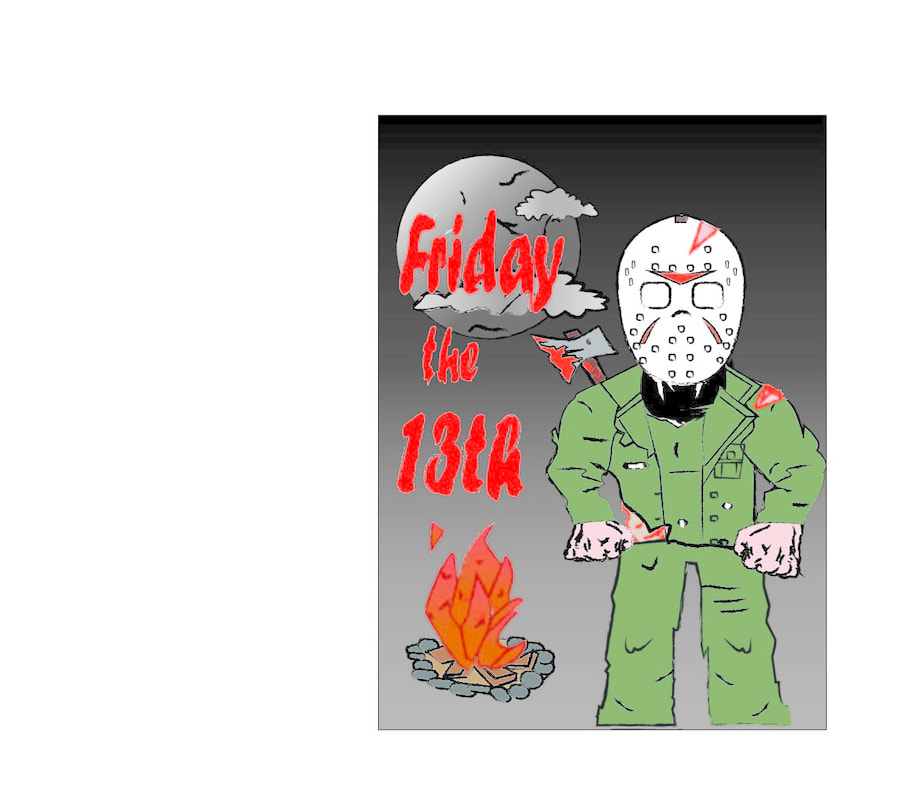
I wanted to choose Friday the 13th for my Typography as I was in a Halloween mood and was still in season after I watched a marathon of my favorite movie series to date. I wanted a grunge theme and this was just perfect to do. I wanted to be creative and not so neat and perfect like my other projects. I wanted this to be messy and disorganized but still have the correct properties of thirds, phi, and a gutter along the sides of the poster. The title of this artwork is Friday the 13th: Jarvis Hunting, because in part 4 Jason is trying to kill Tommy Jarvis and Tommy he saves Trish by killing Jason. Doesn't mean that Jason didn't kill anyone else before. The Elements of Design that I used are perspective as Jason is a lot closer than the fire and the moon as he is always near, watching you right around the corner. I also used color and value to get the right background for the nighttime mood, for the moon to appear as it is, and for the fire to seem like it is actually burning.There was a lot of proportion and scaled with working on him since he always had a big head and a fit body that magically survived the disintegration of the water erosion. I tried to express the dark mood of the film but have that fun and cheesy 90's aspect so I wound up have the cheesy blood, iconic mask, and cheesy bloody lettering of the top to emphasize the importance of these movies in the horror/slasher genre. I imagined this would be more high quality and it would be a bit realistic, but this is illustrator and I am working on getting that experienced on it. This piece will make me appreciate the effort of hard work and detail into an item and watching the project. My goal is to show pure emotion into an art piece with little or no words but rather actions and the setup of a scene, then you may let your imagination run absolutely wild.
Year: 2017
Materials: Adobe Illustrator
I wanted to choose Friday the 13th for my Typography as I was in a Halloween mood and was still in season after I watched a marathon of my favorite movie series to date. I wanted a grunge theme and this was just perfect to do. I wanted to be creative and not so neat and perfect like my other projects. I wanted this to be messy and disorganized but still have the correct properties of thirds, phi, and a gutter along the sides of the poster. The title of this artwork is Friday the 13th: Jarvis Hunting, because in part 4 Jason is trying to kill Tommy Jarvis and Tommy he saves Trish by killing Jason. Doesn't mean that Jason didn't kill anyone else before. The Elements of Design that I used are perspective as Jason is a lot closer than the fire and the moon as he is always near, watching you right around the corner. I also used color and value to get the right background for the nighttime mood, for the moon to appear as it is, and for the fire to seem like it is actually burning.There was a lot of proportion and scaled with working on him since he always had a big head and a fit body that magically survived the disintegration of the water erosion. I tried to express the dark mood of the film but have that fun and cheesy 90's aspect so I wound up have the cheesy blood, iconic mask, and cheesy bloody lettering of the top to emphasize the importance of these movies in the horror/slasher genre. I imagined this would be more high quality and it would be a bit realistic, but this is illustrator and I am working on getting that experienced on it. This piece will make me appreciate the effort of hard work and detail into an item and watching the project. My goal is to show pure emotion into an art piece with little or no words but rather actions and the setup of a scene, then you may let your imagination run absolutely wild.
https://docs.google.com/document/d/1MRJ9ZD874TRiGu4gqQ9SdAfcg9cA7qqXjaiLIgJy7eQ/edit
Sky Net's Judgement Day of August 29th, 1997
Class: Fall Graphic Design
Year: 2017
Materials: Adobe Illustrator
Year: 2017
Materials: Adobe Illustrator
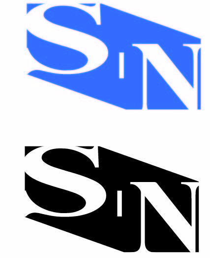
Industrialization is a big subject that Skynet broke the surface of in the 1990's and they seemed like a normal company and they were a normal corporation for a while. I made this piece to bring back a memory from an old franchise I adored as an eight year old. I was motivated to make a logo look decent and much better than what was acceptable then and with my somewhat current art skills that could use some more improvement. This logo looks like an industrial sign warning of something bad with the black but you see around it and feel warm with the blue. The most obvious elements and principles visible are balance, contrast, color, shape, and balance. They bring out the best in the logo as it tells a story, not too visible but still there. It tells of an innocent company that went bad, it shows of the true colors hiding beneath. This logo was made with Adobe Illustrator and it helped make the right colors turn out better and pop to bring the emphasis in the emotion seen. It is mostly not noticeable at first but it will show after some looking into and studying carefully. I was inspired by recently watching Terminator: Genisys and I remembered Terminator: Judgement Day and how the company would make a perfect logo as it was the root of evil and the death of 3 billion and then some, after once promising safety and kind generosity to the public. My goal of this art piece was to show that things look good in certain colors and their true colors shine brightest once seen and this project perfectly explained the true colors of good and evil of the same person, place, or thing being described or seen.
https://www.weebly.com/editor/main.php
90's Saturday Morning Cartoons Infographics
Class: Fall Graphic Design
Year: 2017
Materials: Adobe Illustrator
Year: 2017
Materials: Adobe Illustrator
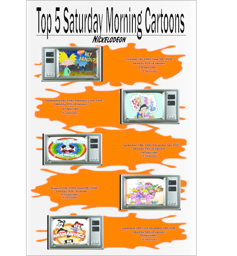
This art piece is described as loud as it screams a million things at you depending on your age and where and how you grew up as a kid. People call something like this nostalgic as it brings back so many memories from their adult, teenage, or little kid years. I created this piece to make people remember all of these cool traditions only on every Saturday at a specific time. The best elements and principles presented are emphasis, pattern, rhythm, and color. They are what make it flow like the orange is supposed to be the iconic Nickelodeon slime they used in commercials and at the Nickelodeon Choice Awards. I was inspired from the VHS tapes in my room after I have seen so many terrible cartoons lately that ruin childhoods or make no sense at all like Spongebob. The 90's cartoons are superior to today's cartoons and it is meant to express a social issue. Kids today watch these for pure fun and boredom for so long, but kids then would watch a few episodes and then go play outside and use their imagination or play with friends. I want to express the silliness of the 90's and cartoon genre range, which I think I did successfully after doing so much research. My goals are to inspire people who see my art and I want them to feel the emotions and memories, good or bad within each of them. They expressed a feeling that I made obvious and clear to grab their attention and this piece definitely did since it tells people a story. It tells a story of a fun and goofy childhood. I learned that photoshop is very hard to use along with not procrastinating and I remembered this exactly as is from my childhood. It is truly nostalgic and it gives me a better idea of how to simplify and express emotions to the viewer. I will carry on these techniques through future artworks as you need a good sketch and to be more sure of a project, this one was unknown and constantly changing. This is what happiness is made of, childhood memories.
https://docs.google.com/document/d/1kf4QwGxV5zwKAe2isTuhotuQRqntu5G1RSa5HXtESe0/edit
